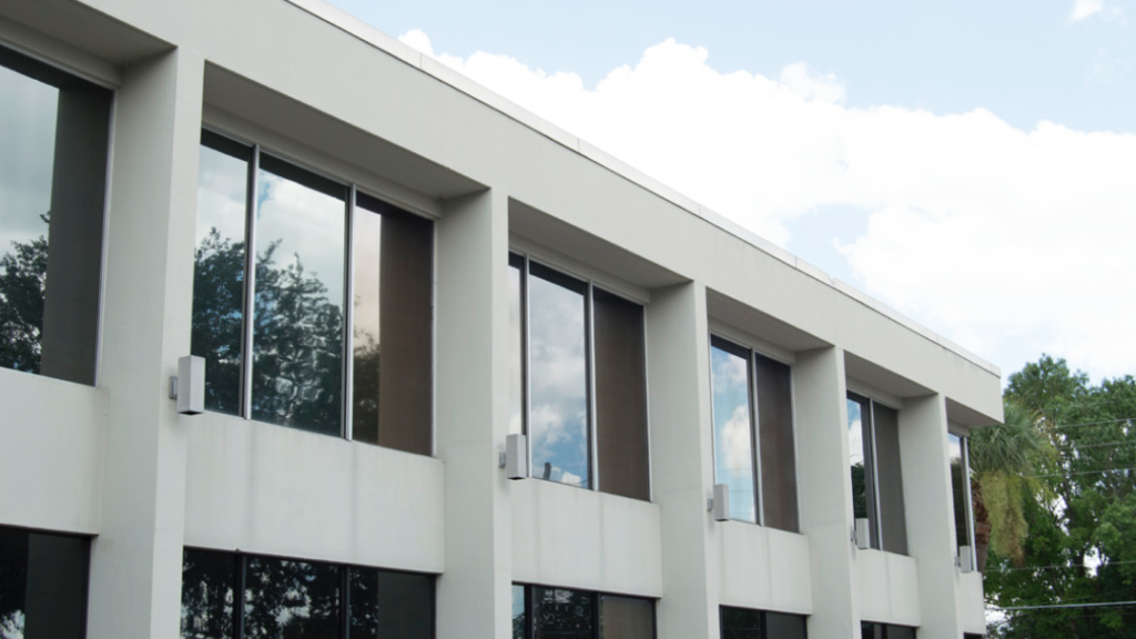
Design aficionados embrace mid-century modern like a new puppy, with midmod clubs and tours in cities all over the nation. Orlandoans have obediently enthused over our own postwar residential relics, lovingly wiping off the accumulation of terra cotta barrel tiles and fiberglass Corinthian columns like mud from the new puppy’s rump.
When it comes to our commercial structures, however, our passions cool. Somehow, when these bigger dogs grow older, they are not as cute. Why this is, and why nobody loves the old Koger Center office park behind the Colonial Target, is a window into Orlando’s psyche. These buildings, midcentury modern to the core, receive more than their share of designer-hurled vitriol because they’re a little uncomfortably too Orlando. Instead of turning our noses up at them, we should embrace them and their part of our local zeitgeist.
The two- and three-story buildings along Executive Center Drive, Lawton Road, and Woodcock Road look like textbook vintage early 1960s modernism. They’re ideally situated a few minutes’ drive from downtown, an early exurbian office park prototype. The dreadful cubicle factories that blight UCF, Lake Mary, and Maitland each seem to be a copy of this earlier, modestly scaled, in-town model. These are clean, with spare detailing and a thoughtful mix of glass, brick, and steel. And yet they languish forever in a “B” class office space mode.

photo by Matt Duke
The local chapter of the American Institute of Architects once had its office in the first building off Maguire, on Woodcock Road. As a somewhat male-dominated society, at least the address might generate sophomoric giggles, but alas, the architects detested this location and the building. It is a two-story affair, with an elegant metal spiral stair rising up through the lobby. One imagines Mad Men’s Megan Draper skittering down the stair to greet Don Draper. The tall, slender columns holding up its sunshade was a Floridian nod to Philip Johnson’s style of “ballet modernism.”
But the architects had a deep and abiding detestation of this building and the “disurbanity” of it all, so they flew the coop. The Koger Center’s midcenturyism just wasn’t good enough. Many of the buildings are diluted knockoffs of the greats like Johnson, Mies van der Rohe, and others. The office buildings are helpfully surrounded by parking lots, which just smacks of the suburbanism we are all taught to hate. Ultimately, the whole scene was rejected because it wasn’t downtown.
Once architects dis a place, word gets around and soon it becomes de rigeur. “They ought to tear it down and build a mixed-use,” mutter developers, as if we don’t have enough empty street-level shops, parking garages, and ill-designed apartments in Orlando. To wish a pox such as this upon the unloved office park seems needlessly harsh. What is it about the old Koger Center that causes such loathing?
I’ve hunted around it for clues. From a windshield, the buildings present a certain thoughtfulness of design at the medium scale. 988 Woodcock has a row of cheeky looking hourglass columns behind which beige brick lurks, suggesting Oscar Niemeyer, godfather of tropical modernism. One building is reminiscent of Hawaii, with black lava rock anchoring its ends. Several use I-beams as decoration, like Mies did on the Seagram building. Corners are nicely resolved. Minimalist canopies heroically grace the entries. There’s a whole lotta midmod going on here.
But what is really going on with the Koger Center is that it is derivative, not original. The mid-century modernism isn’t terrifically unique, but it stands on its own. As office parks go, it is spread out, so the design of each building loses its impact in the sea of parking that surrounds it. There’s no “fire” between the buildings to excite a viewer. By the time you park and walk to the front door, you just want to get in, for god’s sake, and not admire the clever connections of materials.
These criticisms seem to echo criticisms of Orlando in general. We’re unique, and of course we are special, but we really aren’t all that remarkable yet. We haven’t quite found our design voice yet as a city, at least not like Miami, Austin, or Portland, or other cities of this size. This lack of self-confidence shows in our homegrown efforts like “Orlando doesn’t suck” t-shirts and the cheesy glass and stucco boxes that pass for modernism around town.
We’re also spread out. This is a fact of Orlando that is most difficult to overcome. Between UCF and the west side, there are a whole lotta stoplights to stop at. Geographically, we’re not nearly as large as L.A., but our density is so low that the effort to get from place to place is sometimes just too much. As a result, there is no energy, no fire between the districts, no boundaries or turf wars. No unique design to the city’s parts that give spice and color to the neighborhoods.
The Koger Center still has some very nice architecture to it, work that has stood the test of time. The current landlord would do well to relax it a little bit, let a few new buildings pop up in between, and accent its midcentury modern vibe more; really go for it.
Orlando should consider the same thing as well. The city should relax things a little bit, and not always feel compelled to script out the game quite so closely for actors in the city—developers, neighborhood associations, artists, and so on. If we could all get together and say “back off—we got this,” there would be a voice to Orlando that might just arise and create a new future. The puppy, so cute, may just become a show dog someday.
